The reports section portrays a graphical representation of the progress of your Twitter account. It shows how many tweets are liked, retweeted, how many accounts are followed and more such information distinguished on the basis of dates.
When you have opened up TweetFull’s website, go to the ‘Reports’ section to view your account statistics.
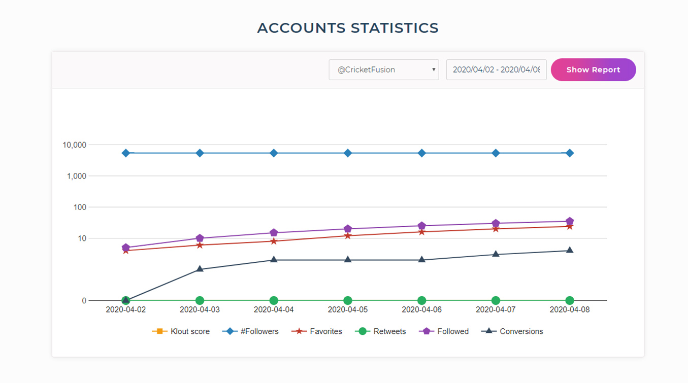
This graph will help you compare each information given at the same time. A different color is used for each category which aids in differentiating every detail easily. This is a clubbed report of activities of all the Campaigns together.
Klout score:
This measures your account’s ability to influence other people or accounts. It is basically the measure of your activity and the usage of social media. It serves as an accumulation of your account’s activities, including the size of your network and the activities undertaken by them too.
Followers:
This will show the number of people that started following your account on any particular day. Just point the cursor over the shapes and you will be able to see the exact numbers.
Favorites:
Favorites refers to likes in this case. This scale will display the number of tweets that have been liked on your account’s behalf.
Retweets:
The number of retweets made in a day are shown up using this green colored line.
Followed:
If you want to check the number of people that are followed on any specific day, you can find it out here.
Conversions:
When you engage with an account, follow it and it follows you back, it is known as a conversion. Analyze the conversion score through this line-up.
If you see that many retweets are made in a day or fewer tweets are liked, or anything related to the above factors, you can edit the Campaigns accordingly and see better results. Along with that, you can filter the entire report as per a date range.
At the start of the graph, there is a drop-down menu. Clicking on that, you will see all the names of Campaigns that you have made. When you want to see reports of your Campaigns individually, you can choose it here and snap the ‘Show report’ button. It will show you a whole together different graph of that particular Campaign's activities.
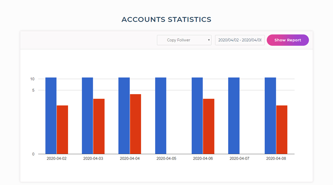
The blue bar in the above graph shows the number of followers that are copied, i.e. the number of people followed from your competitors’ followers list.
The red bar depicts the number of conversions received on that particular day, i.e. the number of people who followed your account back.
When there is a lot of data shown in the graph, you can filter it as per certain dates to see a more clear representation.
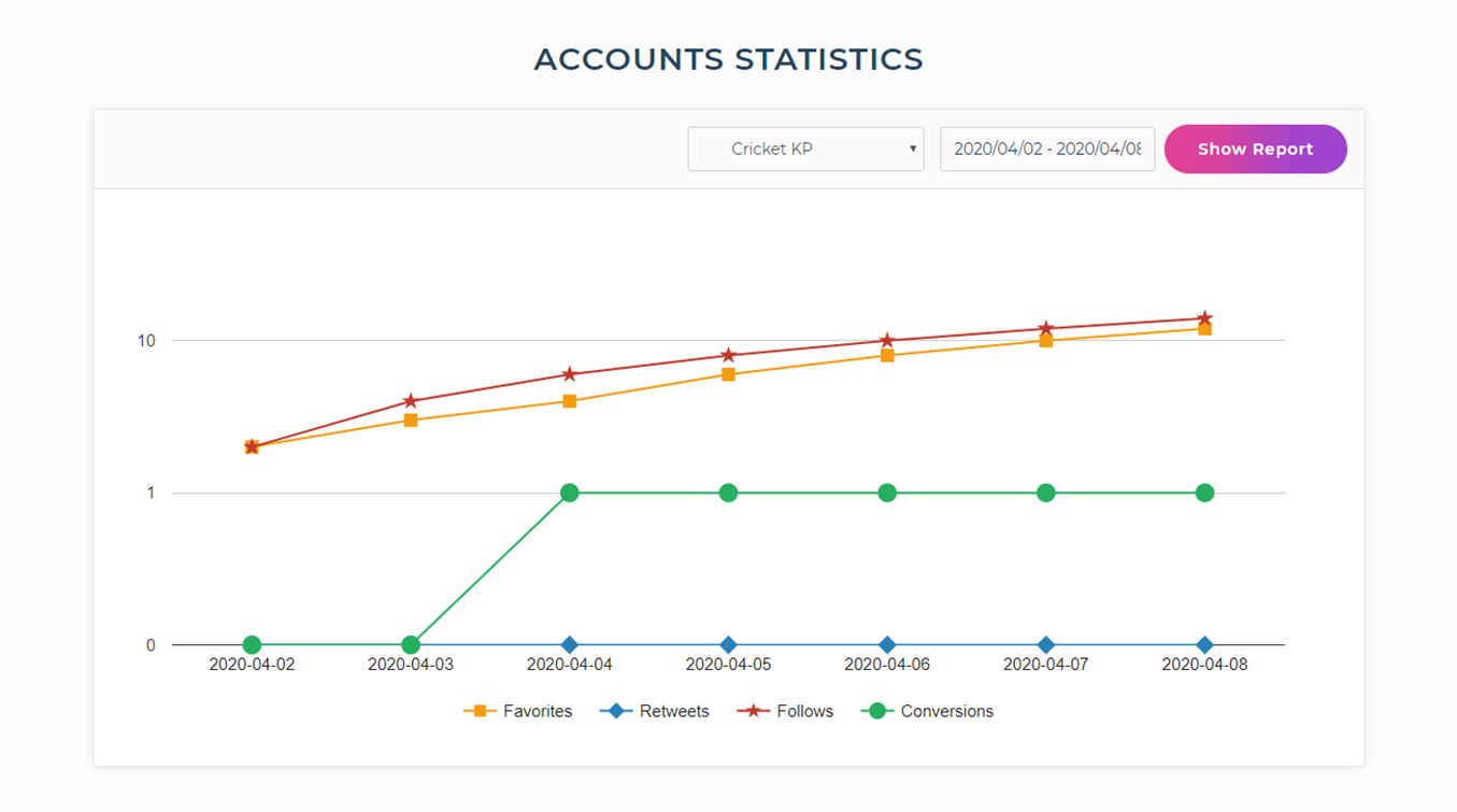
From here, you will get an idea of how your keywords are performing. It will demonstrate mainly four criteria - Favorites, Retweets, Follows, and Conversions.
If the conversions are gradually increasing, it would mean that the keywords that you have entered in the Campaign are relevant. If not, try researching more significant keywords and hashtags popular in your niche.
Here too, filtering data based on dates is possible by selecting the desired scale.
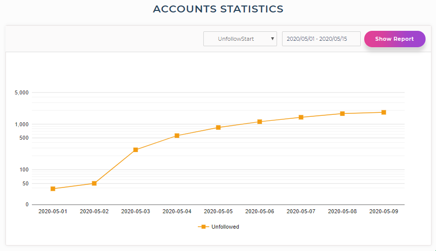
As the ‘Unfollow them’ Campaign works on only one parameter, which is unfollowing irrelevant people, you will see a single line in the report. This orange line shows the number of accounts that are unfollowed.
You can filter this data by setting a custom date range too.
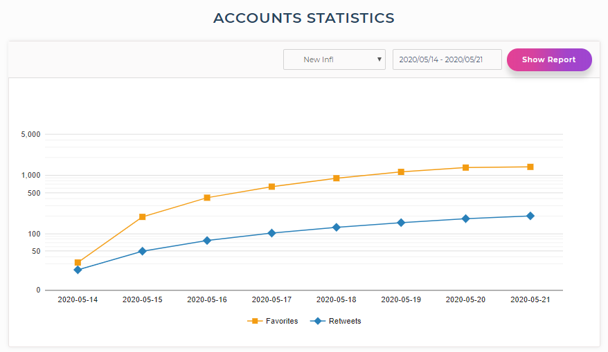
Here, you can keep a track of the number of likes and retweets made on a particular day.The orange line depicts the ‘Favorites’, i.e. the total number of tweets liked in a day and the blue one shows ‘Retweets’, i.e. the total number of retweets made in a day.
If you want to check the performance of a particular week or month, just change the date range.